Christmas Card


This is a Christmas Card that I received at a swap a couple of months ago. I love the Seasons of Joy Stamp Set. It looks great with classic Christmas colors or soft non traditional colors. The gold cord also from the Holiday Mini catalog is elastic which makes it easy to work with. This Wednesday I have the opportunty to help out at My friends church. This is one of three cards that we will be making with her group of girls.

If you want to order any of the mini catalog items they are available to the end of this month.


photography

Today I want to share some pictures with you. In my last post I shared part of my wedding gift for my sister. Today I am going to showcase my other sister. I love both of sisters dearly and with one in South Dakota and one in Washington and myself in Michigan we don't see each other often.

Lisa is an amazing photographer. She has a keen eye and has a knack for catching unique objects and angles. Her wedding gift for our sister was a matted and framed photo of the Light House and Pierre at Grand Haven taken on an afternoon that us threes sisters were there together. And all of these were taken with a Fuji point and shoot camera.


This is the wedding gift picture.


This is a small town Iowa near where we grow up. I love the way the trees frame the field and the barn. You may have seen this barn! This is a dairy barn that was built by the show "Make a Wish" with Amy Grant. My dad and brother were contracted by the network to install all of the dairy equipment. They didn't do it in a day it actually took several weeks.


scrapbooking

This past summer my sister Tammy got married. When it came to a wedding gift I wanted to do something special. Buying kitchenware just didn't feel personal. So two weeks before the wedding I decided to make a wedding scrapbook. It turned out so cool! Tammy loved it which was the most important, and the others at the gift opening party liked it as well. Tammy's colors were Vintage Violet (one of the in colors from last year), silver, and white. The tuxes were black. My original intention was to incorporate more stamping but as my plan came together I decided not to do much stamping.

My shopping list:

Stampin' Up!
1 ream 81/2 x 11 Vintage Violet cardstock
2 reams 12x12 black cardstock
1 ream 81/2 silver cardstock
1 Vintage violet re-inker
1 Vintage Violet ink pad
1 roll silver organdy ribbon
1 roll wide and narrow white organdy ribbon
1 roll silver cord
ticket corner punch
1 roll 1/4 inch white grosgrain ribbon
I dyed several yards of each of the white ribbons in Vintage Violet
*Note: This list was ordered before the new catalog came out. If I had to do it now I would have substituted Perfect Plum for all Vintage Violet, and Taffeta ribbon for the organdy. There is stretch cord in the holiday mini catalog. I also would have ordered the Pretties kit rather than buying the flowers and pearls elsewhere.

Other
12x12 Wedding Album
5 sheets of 12x12 paper that matched vintage Violet by Laura Ashley
5 sheets of 12x12 white paper with a monochromatic print by Laura Ashley
1 sheet of 1/2 pearls Karen Foster
white flowers (dyed Vintage Violet)
Clear stickers with wedding party titles
Ink jet transparencies-I used these to print titles and labels the the "Sticker sheet" didn't have. by using the same style of fonts the "look" of the pages stayed consistent.

Tools
adhesive
glue dots
paper trimmer
scissors
A summery of the pages. All the pages are black accented in the silver, white and Vintage Violet.
Unfortunately the pics are not near as clear as I would like them to be. I took them on the bathroom floor in the hotel the morning after wedding. They turned out much more stunning than what shows up.
This is first half of the book


Back to School Swaps 2


Here is the next set of Back to School Swaps that I received last week. Don't you love the clipboard?!! The silver star and mini frame are not metal. It is chipboard embossed with silver embossing powder. The little accent squares are the colors of the theme in little strips that have been put through a crimper for added texture. The talant of the ladies in this swap group is amazing!

Back to School Swaps


I am part of a Yahoo group that Swaps theme elements every month. The month of Sept. was "Back to School" I just received my bag of goodies last week. They are soooo cool. Here is the title bar and some of the tags. They are going to look cool on my School pages from this fall. I love how the spiral punch was used on the white in the title bar. The word "back" in red just pops out at you.

Scrapbooking


It's almost time for another Scrappers night Out. You won't want to miss making these great fall pages. I love the fall colors in the Fall Flowers Designer Paper. You can use the flowers for a girlish look or the stripes for a boyish look.


The Halloween layouts are going to be so much fun to make. You will get to use some of the different SU punches to make some cool embellishments. You will love how "quick and easy" will totally impress those who look at your pages.


I couldn't resist these layouts when I saw them on Heather Summers blog. The color combinations in the Cutie Pie Designer Paper are beautiful. These versatile pages can be used for so many different occasions.


Our next Scrappers night out is Thursday September 27 at 6:00 pm. The cost is 6.00 per double spread. you can order as many spreads as you want including duplicates. Please respond by Saturday September 22nd with your order. You can email me at klangstraat@sbcglobal.net or leave a comment after the layouts. See you on the 27th.


Three for You Punch card


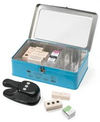
I love the three for you punch box set. The punch has endless possibilities. Here is an adorable card made with the Three for You punch set. I recieved this card on a swap and the name isn't on it for credit. I love all the flowers that are punched from the Prints Designer Paper and the vase is just a square of the same. The sentiment on the bottom is from the stamp set that comes in the Punch box.


And did you know all the rubber for the Three for You punch set is die cut? This means you do not have to trim it!


If you want to order this set you can contact me via email klangstraat@sbcglobal.net

Three For You Punch box Promotion

Punch a Bunch


You won't be able to resist punching a bunch of beautiful projects when you see what's inside our Three for You Punch Box! This fun keepsake tin holds
the exclusive Trio Flower punch,
a coordinating 9-piece die cut Three for You stamp set,
and three Stampin' Spots in Purely Pomegranate, Wild Wasabi, and Basic Black.
But there's even more to love. During August, we're throwing in an exclusive package of 30 textured Love Notes (a $12.95 value) free when you purchase the Three for You Punch Box! Create Purely Pomegranate, So Saffron, and Wild Wasabi notes and other on-the-go projects using the Three for You Punch Box. You'll find it's such a cinch that you'll want to punch and stamp bunches!

Scrappers Night Out, August 23


Here are the pages for our August Scrappers Night Out. Although I did take my kids to the zoo this summer sometimes I feel like our household is a zoo! Celebrate fall with the start of school and maybe even some apples somewhere along the way.

Our next Scrappers night out is Thursday August 23 at 6:00 pm. The cost is 6.00 per double spread. you can order as many spreads as you want including duplicates. Please respond by Thursday August 16 with your order. You can private email me at klangstraat@sbcglobal.net or leave a comment after the layouts. See you on the 23rd.

Scrappers Night Out

It's that time again Thursday July 26, and Fri July 27 is time for our monthly Scrappers Night Out. Here are the layouts that we will be doing. I love the way they turned out!


You can sign up by emailing me, leaving a comment her or calling me. I am looking forward to hearing from you! Contact me by Tuesday July 24 to let me know if you are coming on Wed or Thursday.
They are inspired by Heather Summers, Sue Feenstra, and a Split Coast friend.
All images copywrite Stampin' Up! 1997-2007

wedding week end


She has long thick hair down to her hips. We put sponge rollers in it the night before to get a head start on curls. She was a trooper as she had to sleep on those rollers Fri night and sat very still as the beautician was doing her hair.


My two girls.
When D put on her flower girl dress she said now I really look like a princess! 15 year old T also felt pretty in her new dress.


Summer is officially half over. It is going by so fast! This past week my family and I spent a week in Iowa for my sisters wedding. It was fun spending time with my sisters, brother and our nephews and nieces. We even found out that the Tux shop actually carried a size 18 shoe for "our little nephew" Andy who is 22 and 6' 7" My 5 year old was the flower girl, she looked adorable-she knew it too! My 15 yeat old sat at the guest book and looked beautiful. It was a fun week end and we are all so happy for Tammy and Matt.

Scrappers Night Out

Here they are!! The first 6 pages for the June Scrappers Night Out on Thursday June 29 from 6:30-9:30 or Friday from 9:00-12:00. I love how the pages turned out! The first Double Layout is "Find Joy in the Little Things" this was inspired by wildforstamps off of Split Coast Stampers. It features the Petals and Paisley Designer paper from the Spring Mini with coordinating card stock.


The second set is "Fourth Fun" inspired by Dawn Gering also off of split Coast. Celebrating our nations birthday this layout features patriotic card stock with white craft ink.


The Third set "friends" inspired by Sharon Harnist off of her blog Paper Fections features the Au Chocolate Designer paper from the Spring Mini. I love these pages!


Each set of pages will be made into kits according to your order. When you arrive you will receive your kit and go to different stations at your own pace to stamp and assemble your pages. This way you can adjust the time to work for you. You may want to change the titles on your pages to fit your pictures, there will be a coordinating alphabet stamp set and ink pads available to do so. You will need to bring adhesive and a scissors. You can also bring a paper trimmer if you have one.


Please RSVP via email, a message under the comment section of this blog or by phone by Friday June 22. For details on price etc. go to my events on my Stampin' Up! website. I'm looking forward to hearing from you.

If you are interested in registering for this class you can email me.
All images are copyright of Stampin' Up! 1997-2007


I wanted to try a card using the faux metal technique. I love the way this card turned out.

The stamp set is Looks Like Spring. I used Cameo Coral cardstock for the card base. I took a square whisper white cardstock and stamped the flower from looks like spring using Cameo Coral classic ink. I mounted the flower on Chocolate Chip card stock. I used a Tempting turquoise button from Fresh Favorites 1 for the final touch on the flower.

For the faux metal piece:
I set out my versamark pad and stamped the for you stamp from Happy Everything in the Versamark pad so it would be ready when I needed it. I took a square of whisper white card stock and placed the whole square on a versamark pad. I then covered the versamark with Gold Glory embossing powder. Holding the square with my tweezers from my Crafters tool kit I melted the embossing powder with my heat gun. I covered the first layer with versamark again and added another layer of gold e.p. and melted it with the heat gun. While the melted powder was still hot I quick poured another layer of gold e.p. on the piece. This time I held the heat gun under the card stock and heated from bottom up. This leaves a smoother finish. While the embossing powder was still hot I took my "for you" stamp and stamped it into the gold. It made a beautiful imprint of the words. I then took my Designer label punch, centered the words and punched out the label. I punched an 1/8 inch punch in each side of the label. I also punched two 1/8 inch holes about 1/2 inch above the bottom of the card and another hole about 3/4 of an inch from the bottom. I laced gold cord through the holes on the label and the holes in the card. I secured the label with snail so it would stay in place.

I mounted the flower on top of the label and stamped "Happy" at the top with Chocolate chip classic ink.

Name Frames


Name Frames are one of my favorite projects to make. They make an awesome gift for a baby all the way to adult. This past Christmas I made them for all of my nieces ranging in age from 11 to 18. They all loved them and said that it was one of their favorite gifts. The frame I use most often is from Walmart for only 3.00. It fits a 6" by 12" size paper perfectly. Here are two I made for my own kids Kirk and Danika. What makes Stampin' Up! products perfect for projects like this is that everything coordinates and matches. The ribbon matches the paper which matches the ink, which matches the card stock. It makes for a very classy looking project. They aren't in frames yet. On Monday July 30th I am going to be having a class where we will be making these. Click here for details.

For Danika's I used the Loves Me paper from the Winter Mini. Unfortunately it is no longer available, but Stampin' Up! has many different papers that are just as pretty. Using the Headline Alphabet I stamped the letters with Regal Rose classic ink on Whisper White card stock rectangles. I mounted the white rectangles on Pretty in Pink card stock. I embellished with some Hodge Podge Hardware, silver brads, and bits of of Stampin' Up! ribbon. The flowers are punched with the Daisy Punch and the Spring Bouquet Punch.


For Kirk I definitely wanted a more "boy" look. I used Four Seasons designer series paper mounted of Night of Navy Card stock. The letters are the Headline Alphabet with Real Red Ink on Whisper White card stock mounted on Real Red Card stock. I used Pewter Hodge Podge Hardware to embellish the letters and a piece of Hemp Twine colored with a Night of Navy Marker.


Home


This past April my 5 year old daughter and I took a little trip to Iowa. We were there to go flower girl dress shopping for my sisters wedding this summer. We also attended a couple of wedding showers and helped make 230 wedding invitations. Danika is our only child that has never lived in Iowa so it was fun showing here where Kirk and Tricia were born, where we lived, and the church where her dad was Pastor at. One of the places we took Danika was the Way side Chapel. There is something quaint and charming about this tiny little building located in the middle of Iowa cornfields. There have been a few weddings through the years, but mostly it is a place to stop for a minute and just soak in the peacefulness. I made a little 6x6 scrapbook page of Danika in the chapel. I wanted to capture this little moment in time where we celebrated our faith in a simple way.


The background is Tempting Turquois, the three strips of designer paper is Petals and Paisly from the Spring Mini Catalog. The picture is mounted on Regal Rose, I printed Wayside Chapel on Rose Red cardstock and puched it with the tab punch from the Spring Mini Catalog. The flower is from Bazzil and the inside flower is Rose Red punched with the Spring Bouquet Flower Punch with a silver brad for a finishing touch.

Happy Days


This is a card I made last week for a swap at a meeting with my upline. The challenge was that everything for the card had to come from the Spring Mini Catalog. I decided to use the Office Accroutrement set on page 14. The Chocolate Chip cardstock is punched with the spiral punch on page 17 down the side. The small flower stamp was stamped in Versamark to make a subtle background. The large flower is stamped on Whisper White cardstock with Tempting Turquoise classic ink and the small flower in Chocolate Chip classic ink. both are cut out and layered onto the Chocolate Chip Cardstock. The memo stamp was stamped in Tempting Turquoise cut out and placed off center at the top of the Chocolate Chip Cardstock. The tab is punched from Regal Rose Cardstock with the tab punch from page 17. The "happy" is from Petals and Paisley in the Spring Mini Catalog and "days" from the Amazing to Zany set. That is all layered onto Tempting Turquoise Cardstock for the card.